NYC Citi Bike Share Program Analysis. Part 1: Performing analysis
Project background
Since 2013, the Citi Bike Program has implemented a robust infrastructure for collecting data on the program's utilization. Through the team's efforts, each month bike data is collected, organized, and made public on the "Citi Bike Data" webpage.
This project involved extracting a few NYC Citi Bike datasets and using to visualize and determine answers to company leadership questions.
The data was extracted from the website, transformed in a Jupyter Notebook using Python and Pandas then cleaned in a BigQuery using SQL queries and pushed out to a combined csv to then load into Tableau.
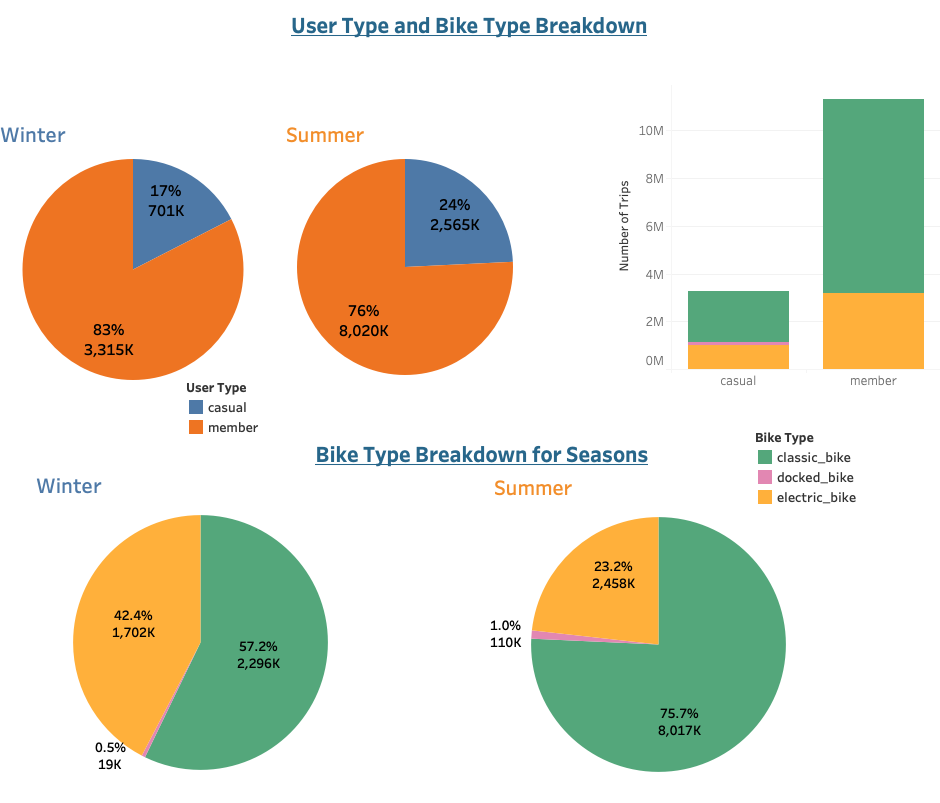
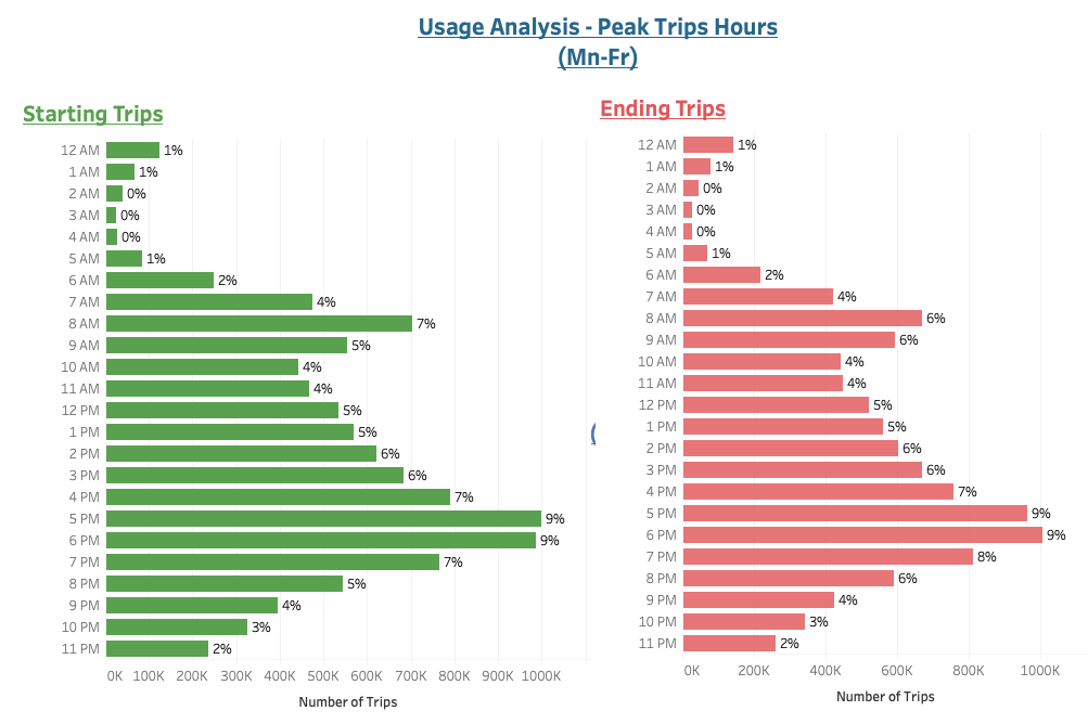
Each of the visualizations created contains interactive features for users to explore the different trends related to short-term customers and annual Citi Bike members, peak hours and days of the week, and the breakdown of bike types and seasons (winter and summer).
A report of findings you can read here.
Some of the questions answered include:
How many trips have been recorded total during the chosen period?
By what percentage has total ridership grown?
How has the proportion of short-term customers and annual members changed?
What are the peak hours in which bikes are used during summer months?
What are the peak hours in which bikes are used during winter months?
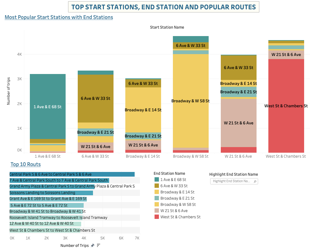
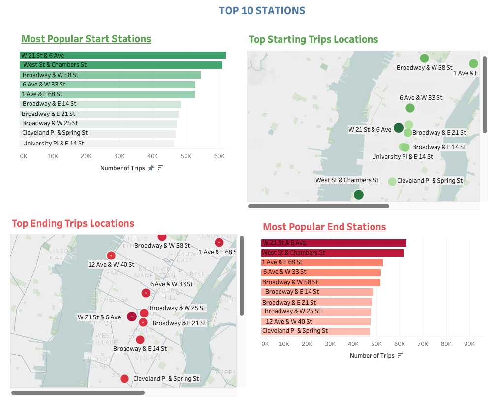
What are the top 10 stations in the city for starting a journey/ ending a journey?
What are the bottom 10 stations in the city for starting a journey/ ending a journey?
What is the bikes type breakdown of all participants, short-term customers and annual members?
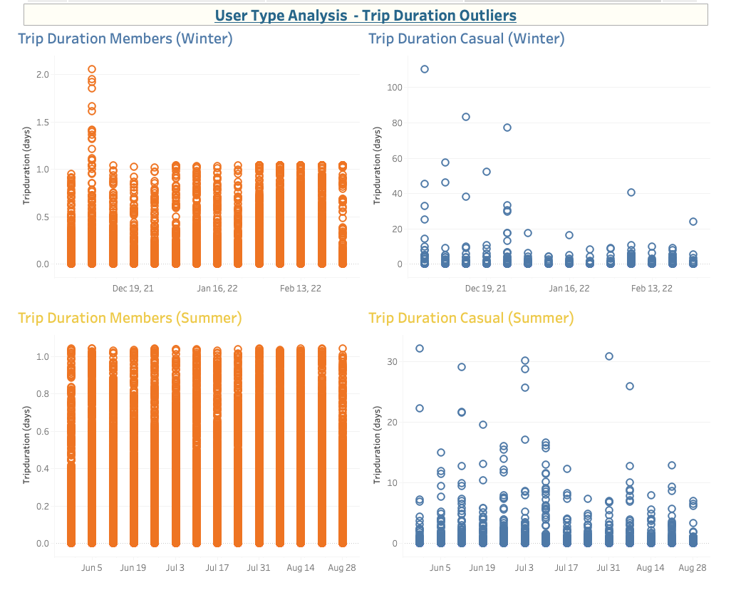
How does the average trip duration change?
Datasets Downloaded: (3 months of Winter 2021-2022 & 3 months of Summer 2022)
- 202112-citibike-tripdata.csv
- 202201-citibike-tripdata.csv
- 202202-citibike-tripdata.csv
- 202206-citibike-tripdata.csv
- 202207-citibike-tripdata.csv
- 202208-citibike-tripdata.csv
Note: The datasets used are not included in this folder due to storage space, but can be downloaded from this website directly.
Performing analysis
Transforming dataset with Python and Pandas
- Use Pandas to calculate the difference between two dates (Started time and Ended time).
Check the format of the data:
df.info()

- Convert the dates to datetime format:
df['started_at'] = pd.to_datetime(df['started_at'], errors='coerce')
df['ended_at'] = pd.to_datetime(df['ended_at'], errors='coerce')
Calculate the difference between two dates as a timedelta and creating a new column 'tripduration':
df['tripduration'] = df['ended_at'] - df['started_at']Calculate the difference between two dates in seconds and creating a new column 'tripduration_seconds':
df['tripduration_seconds'] = (df['ended_at'] - df['started_at']).dt.total_seconds()

- Export the Dataframe as a new CSV file
Repeate for all 6 files.
Cleaning the Data with SQL
- Upload 6 CSV files into a BigQuery tables
- Create a new column "route":
CONCAT(start_station_name, " - ", end_station_name) AS route

- Cleaning tables with SQL queries
Check and remove negative trip duration:


Check and remove NULL data:


- Save new tables and export as new CSV files
Aggregate datasets into one CSV file
Jupyter Notebook was used to merge multiple datasets into one file.
df_winter_summer = pd.concat([df_202112, df_202201, df_202202, df_202206, df_202207, df_202208], ignore_index=True)
As a result, one CSV file was received: [4016535 rows x 16 columns]>
Then the new Dataframe was exported as new CSV file for further analysis in Tableau.
Create visualizations, design dashboards and create a Tableau story
Glimpse of Visualizations:
Popular routes and stations
Map of bike stations
Peak ridership times dashboard

Outliers
Peak trips hours during the day
User type breakdown analysis